
Project Posidia
Project Name:
Recently, I wanted to make progress in Project Posidia but wasn't in the mood to do much in the way of 3D or programming. So I turned to designing a pause menu—specifically, the Equipment Screen. Overall, it's a very simple layout inspired by old RPG's, but presented with a modern visual flare. The layout is divided into three sections. On the left, the player's stats are stacked in a box with a divider displaying some of their active buffs and debuffs. Below that is their level displayed along an experience tracking bar. In the middle, the player can select different equipment pieces in 4 categories, the properties of which can be viewed at a glance in the section below. On the right, there is a 3D preview of the player character.
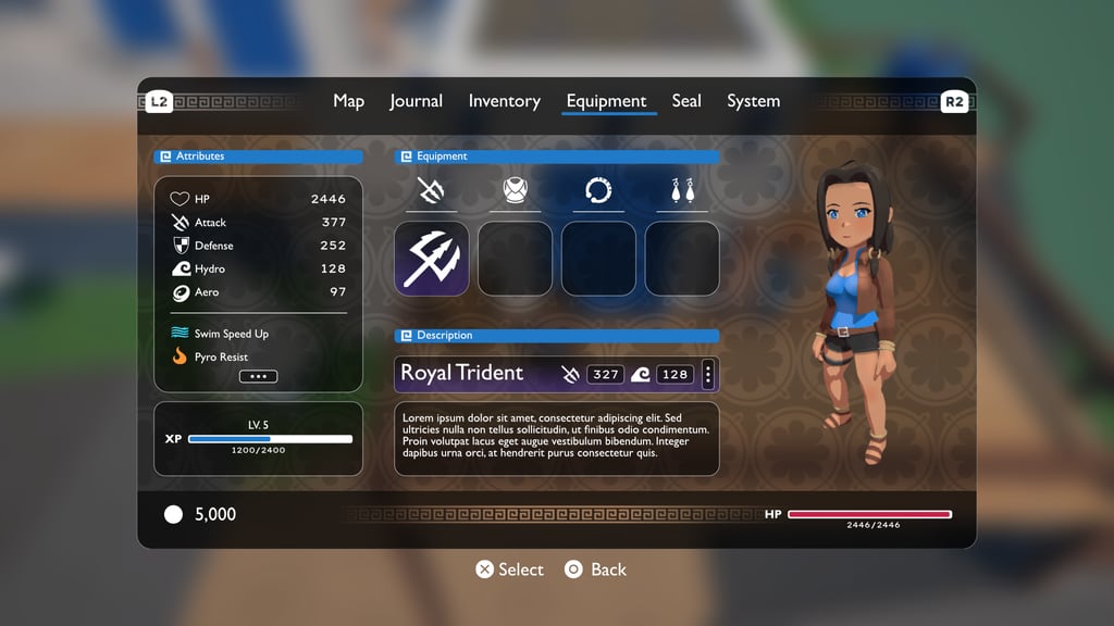

UI Element: Equipment Menu
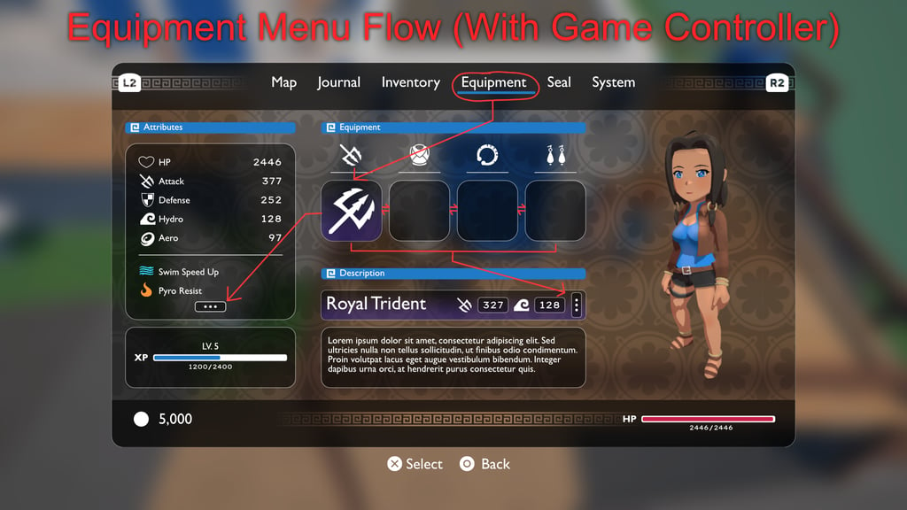

In terms of UX, this menu is designed for minimal effort on both desktop keyboard/mouse inputs, as well as console controllers...which typically require the most thought. Of all of the information on screen, the top tabs can be cycled with the left and right triggers. Once the equipment page is tabbed to, the first equipment slot is automatically selected. From there, the player can push their analogue thumbstick left or right to select different equipment slots. Pressing the 'X' / ' A' button with a slot selected will open a grid menu to select and equip a corresponding piece of equipment. Back on the main Equipment page, the next two possible navigations are conditional. Should the player have more than 2 active buffs/debuffs, then pushing the thumbstick west from the furthest left slot (weapon slot) will automatically highlight the ellipses at the bottom of the attribute menu to reveal the rest. Should the currently highlighted equipment slot have more than two stats that it effects, you can similarly view such stats by pushing the thumbstick south from any equipment slot and selecting the ellipses there. This flow can be visualized in figure 2.
Figure (2)
Figure (1)
Eternal Blue
Project Name:
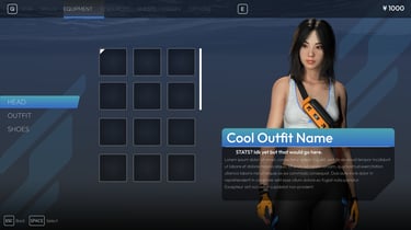
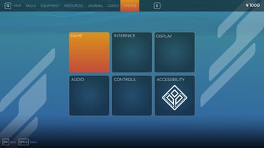
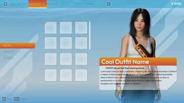
The UI and UX experience for the menu in Eternal Blue is much different than Project Posidia. While it has some similar layout conventions (such as where a 3D character preview is displayed), it is overall much less nailed down due to the more experimental visual identity and the ever-changing nature of the game design. The overall aesthetic and attitude goal here is what I call a post-modern Y2K. This extends from the fashion of characters to the architecture of the game's city, and the design of some pivotal shapes (such as the background designs in the UI).
While the overall specs and requirements of the menu aren't fully detailed, I've mocked up several color variations, There are also concepts for the Journal/Mission/Quest menu and the settings menu—the latter of which is perhaps the most unfinished of what is on display here.
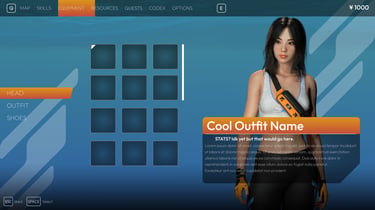
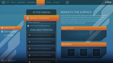


UI Element: Equipment Menu, Mission Menu, and System Menu
